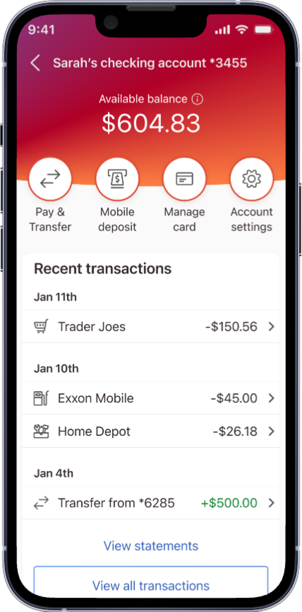
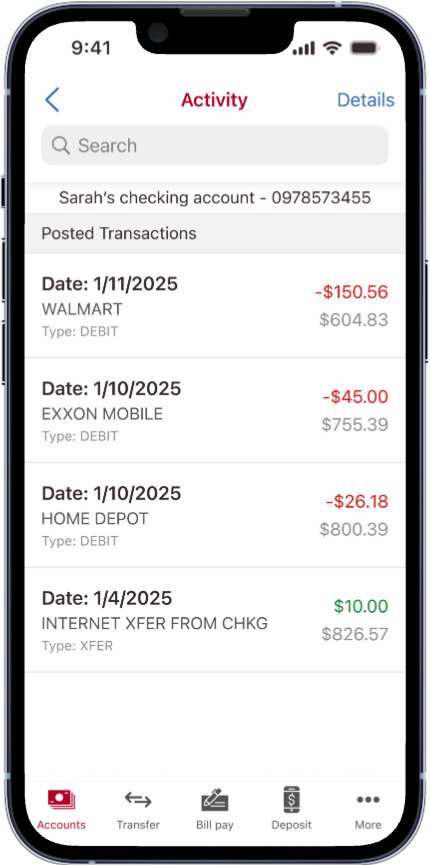
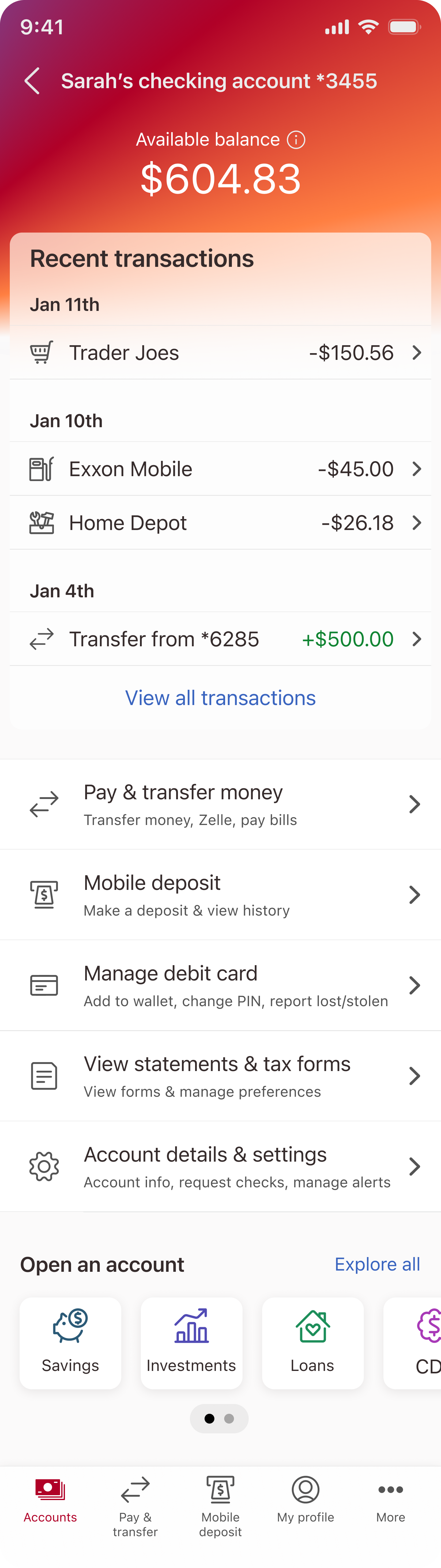
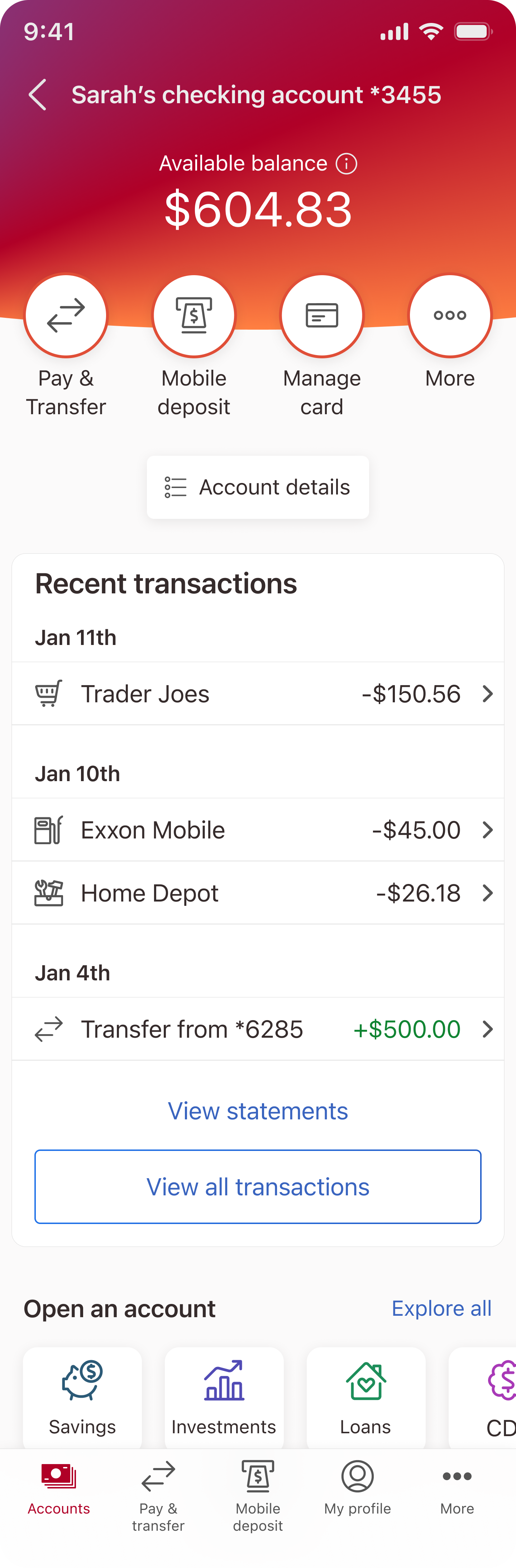
Checking account

Led a data-driven redesign of the checking account experience using A/B testing and user behavior insights. Consolidated key features, improved navigation, and delivered a cleaner, modern UI that reduced user friction and aligned with broader app modernization goals.

1. Discovery

Background

Modernizing our most used account management page.

We set out to improve our checking account experience—the most-used page in our app—to better serve our users and catch up with competitor offerings.

Every design choice was driven by user needs, analytics, and our broader vision for a modern banking app.

Goals:

Feature-driven modernization.

User-centered approach.

High-impact redesign.

User survey

How our consumer survey revealed new opportunities to enhance our checking account redesign.

Goals:

Understand users’ account needs.

Meet business goals of growth, satisfaction, engagement, retention.

Identify high-impact improvements for our mobile-first experience.

250

Responses

49%

Core age demographic

By examining which features users interacted with most, I identified their key priorities. I then used these insights to structure the page hierarchy, ensuring the most frequently used actions were easily accessible and prominent.

Top account features by usage

A/B test

Design validated through user choice.

To ensure our redesigned checking account experience truly met user needs, we launched an A/B test with 250 participants spanning a variety of age groups. Participants reviewed two design options, selected their preferred layout, and shared insights about their account habits, including the features they used most and the information they valued.

250

Responses

2

Design
options

65%

Preferred
option B

Key findings:

65% preference for option B

Users overwhelmingly favored the modern, polished design. Strong iconography, bold typography, and clear hierarchy created a visually appealing and approachable interface.

Task-focused layout

By prioritizing core actions like transfers, deposits, and card management in the primary view, the design aligned with real user behavior, making it intuitive and faster to complete key tasks.

Clean and efficient UI

Submenus for lower-use features reduced clutter and cognitive load, confirming that a minimalist, well-organized layout improves usability and ensures the most critical information is always front and center.

3. Outcome & Impact

User insights integration

Applied A/B testing results directly to the final design, ensuring decisions were grounded in real user behavior and delivering a more intuitive experience.

Modernization for business goals

Redesigned the interface with a cleaner, more modern aesthetic to align with broader business objectives and ensure consistency with other recently updated pages as part of the app-wide modernization effort.

Behavioral understanding

Collected deeper insights into user goals and behaviors through targeted test questions, which informed decisions around layout and content hierarchy.

Feature consolidation & navigation

Unified related checking account features into a single experience and improved layout for easier access—reducing user friction and eliminating the need to search across the app for key tasks.

Another one? You got it!

Designed and built by: Meghan Sousa