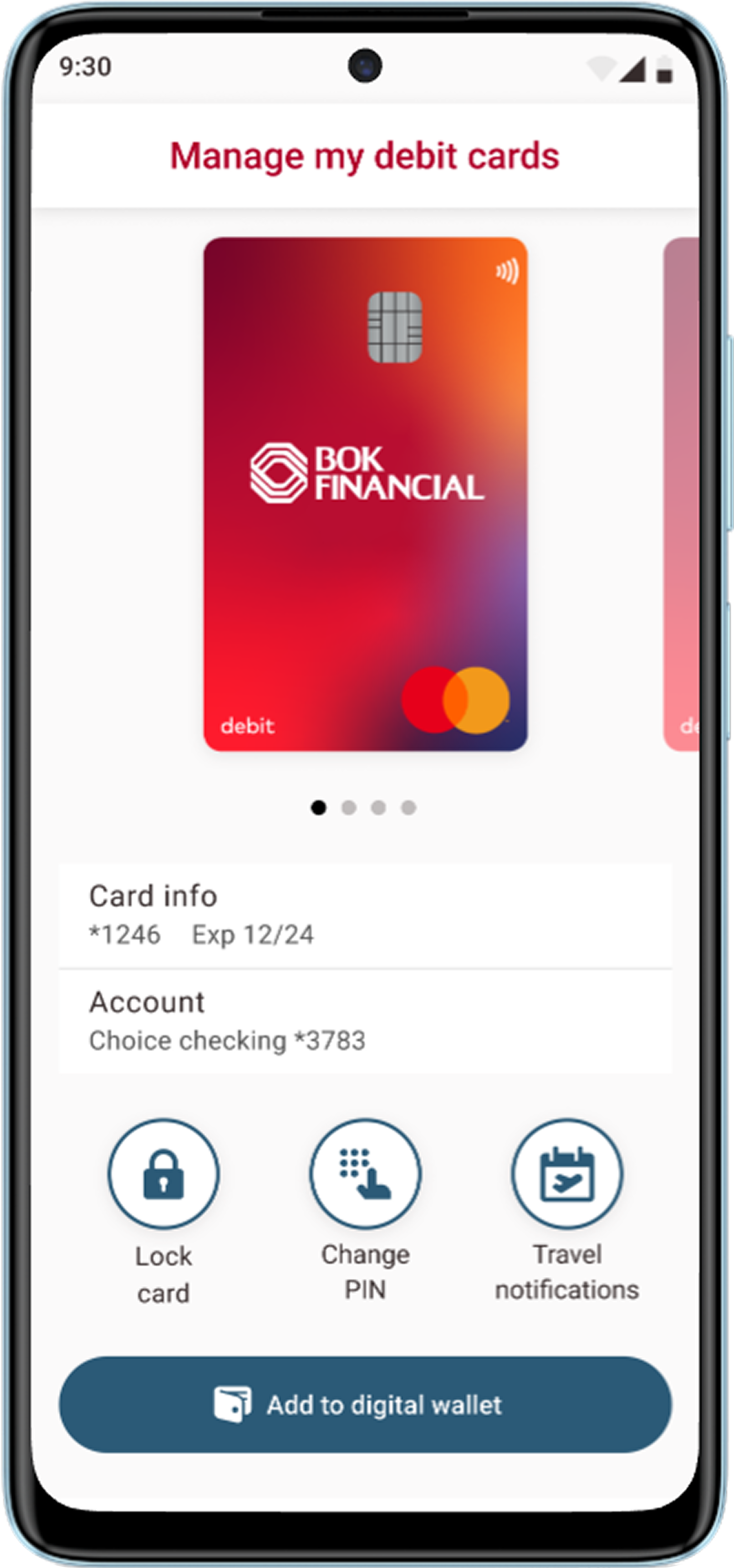
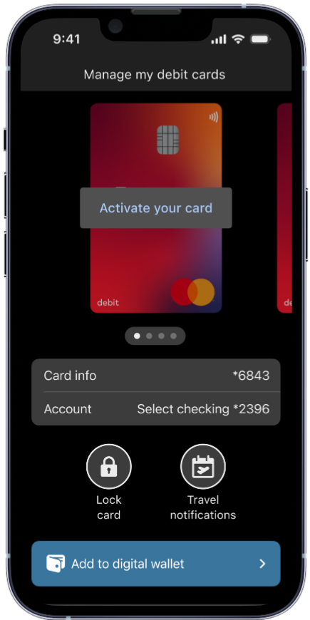
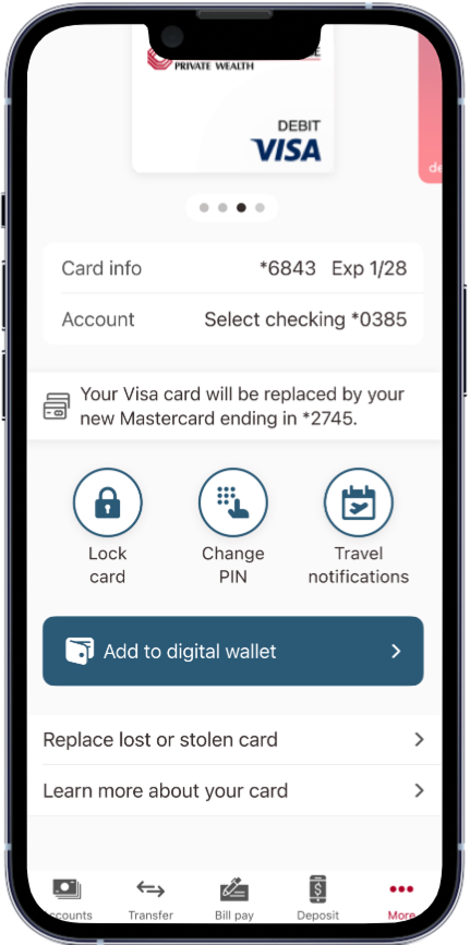
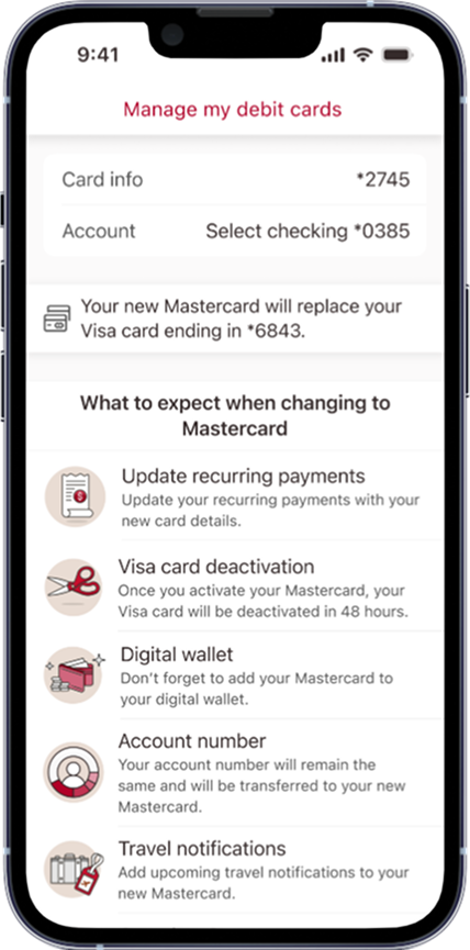
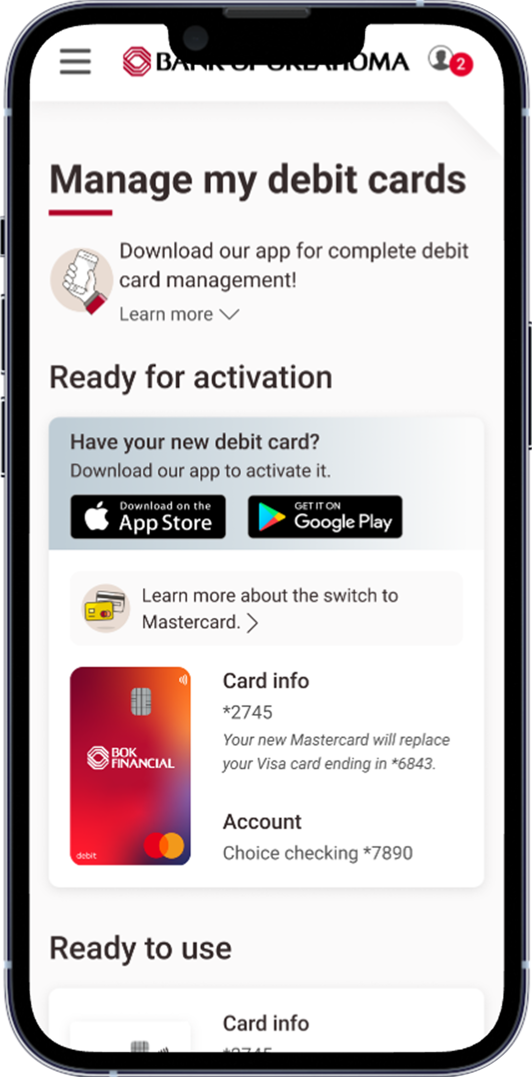
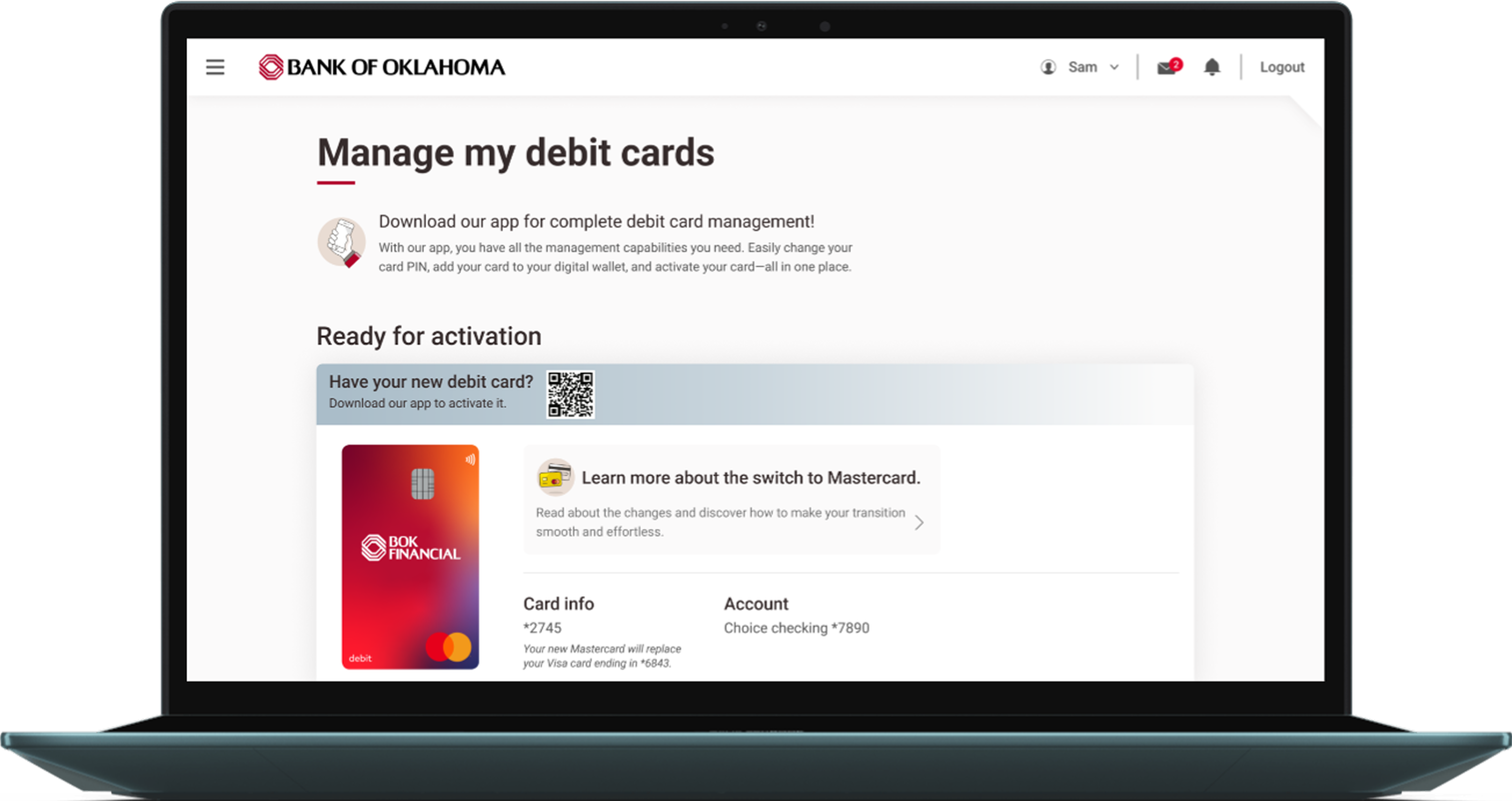
Debit card management
I led the end-to-end redesign of our debit card management experience to support over 400K cards transitioning from Visa to Mastercard.
How our first ever consumer survey revealed new opportunities to enhance our debit card management experience.
Goals:
Understand users’ goals and pain points.
Meet business goals of growth, satisfaction, engagement, retention.
Identify high-impact improvements for our mobile-first experience.
We launched our first consumer survey, reaching users across all markets over 3 weeks. By combining survey insights with complaint logs, we built a balanced understanding of user needs.
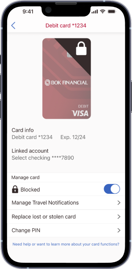
By analyzing debit card management features, we identified which actions users relied on most. I used these insights to shape the page hierarchy, prioritizing quick and easy access to the most frequently used features.

Before rethinking our debit card management experience, I conducted a competitive analysis across 13+ financial institutions and fintech apps using the Curinos digital banking analyzer platform.
Goals:
Uncover common UX patterns while highlighting opportunities to stand out.
Refine copy and streamline user flows for clarity and ease.
Pinpoint gaps in essential card management features.
Key findings:
These insights became the foundation of my design hierarchy, ensuring that the most-used actions were front and center while still leaving space for future enhancements. The analysis also gave me a benchmark for usability, helping me advocate with stakeholders for clearer copy, more intuitive navigation, and accessible design patterns.
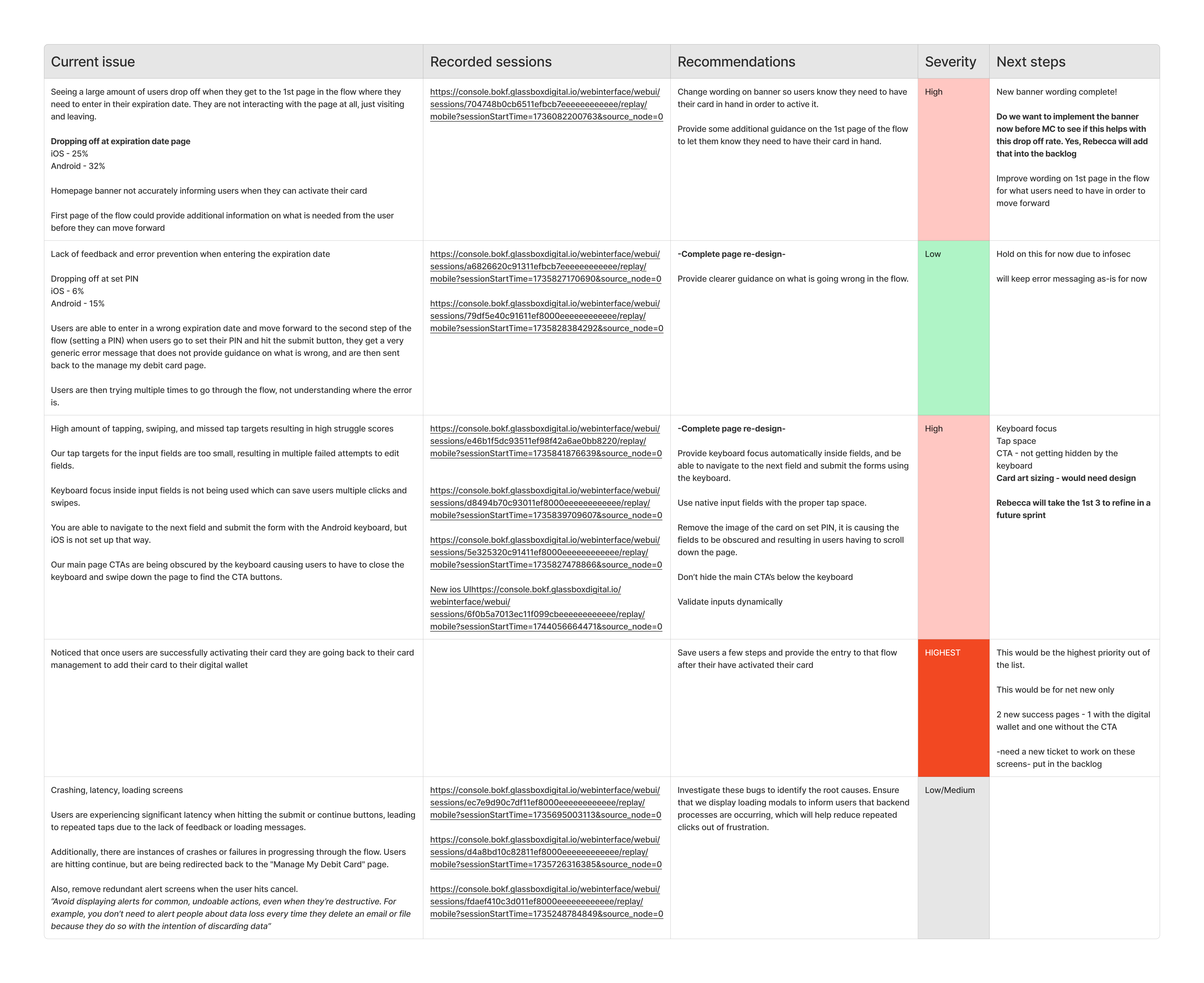
To better understand how users interacted with our debit card management flows, I reviewed dozens of Glassbox session recordings. These recordings gave me a window into real user behavior—beyond assumptions or survey feedback—and uncovered three major usability issues:
Misleading homepage banner copy.
Poor touch accessibility.
False affordances.
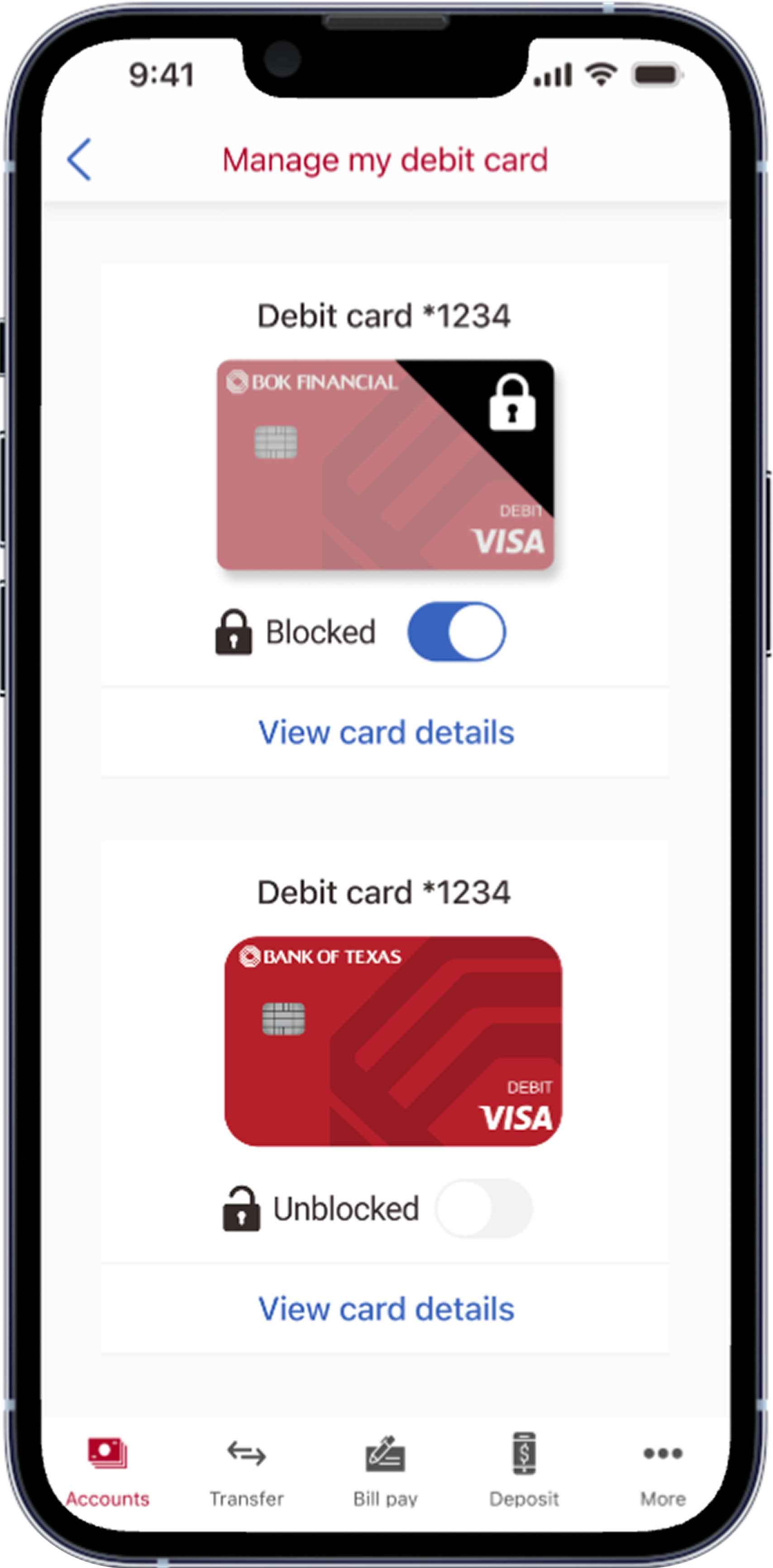
I compiled these findings into a detailed usability report and presented it to product leadership. By combining evidence from real user behavior with clear design recommendations, I secured buy-in to make changes. I then redesigned the affected flows, addressing the issues directly and improving usability across key card management tasks.
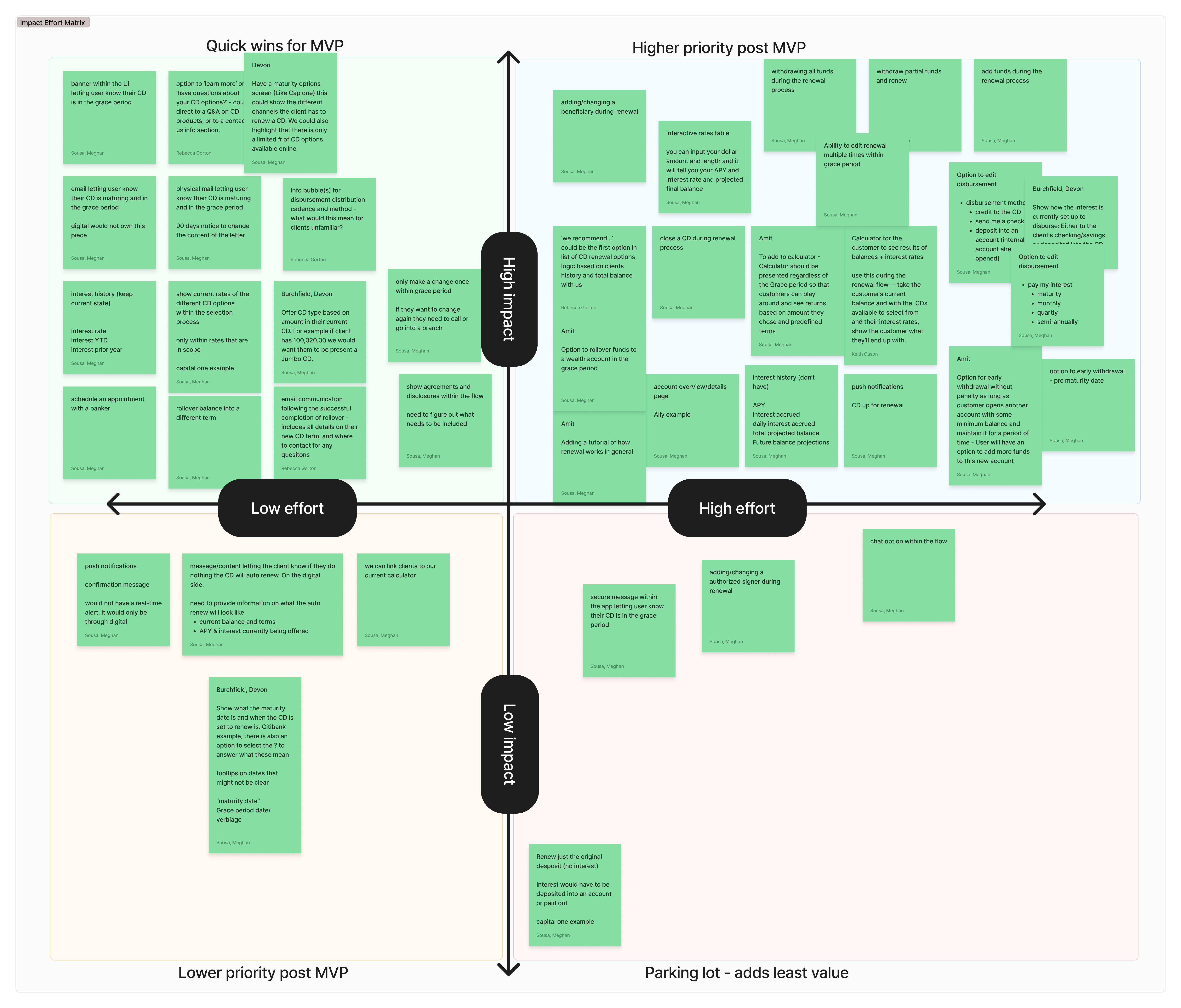
As part of defining the debit card management MVP, I facilitated an impact/effort matrix workshop with product leadership, developers, and stakeholders. Each team member added sticky notes to represent their perspective, and together we voted to prioritize features.
This collaborative process created transparency and alignment, while giving the team a shared sense of ownership. It also provided a clear framework to balance user needs with business goals, ensuring the features we prioritized—like faster card activation and improved security settings—delivered the greatest value with the resources available.


25-35% reduction in user friction
30-50% reduction in usability issues
Improved activation flow
Modernized visual design

Designed and built by: Meghan Sousa