IRA account opening
Redesigned a complex user flow to simplify account onboarding. reduce completion time by nearly half, and boost user confidence through clearer guidance and streamlined decision-making.

Rethinking our IRA account opening flow.
When our team set out to design a new IRA account opening flow, the initial direction was to mirror our existing investment account opening flows. Before diving in, I conducted a UX audit to better understand the current experience and uncover potential issues.
Session replays:
Using Glassbox, I identified where users struggled most. The data was striking: on average, it took 23 minutes to complete the flow, yet only 2% of users finished. Even more concerning, 74% abandoned within the first two steps — a clear signal that the experience was far too complex
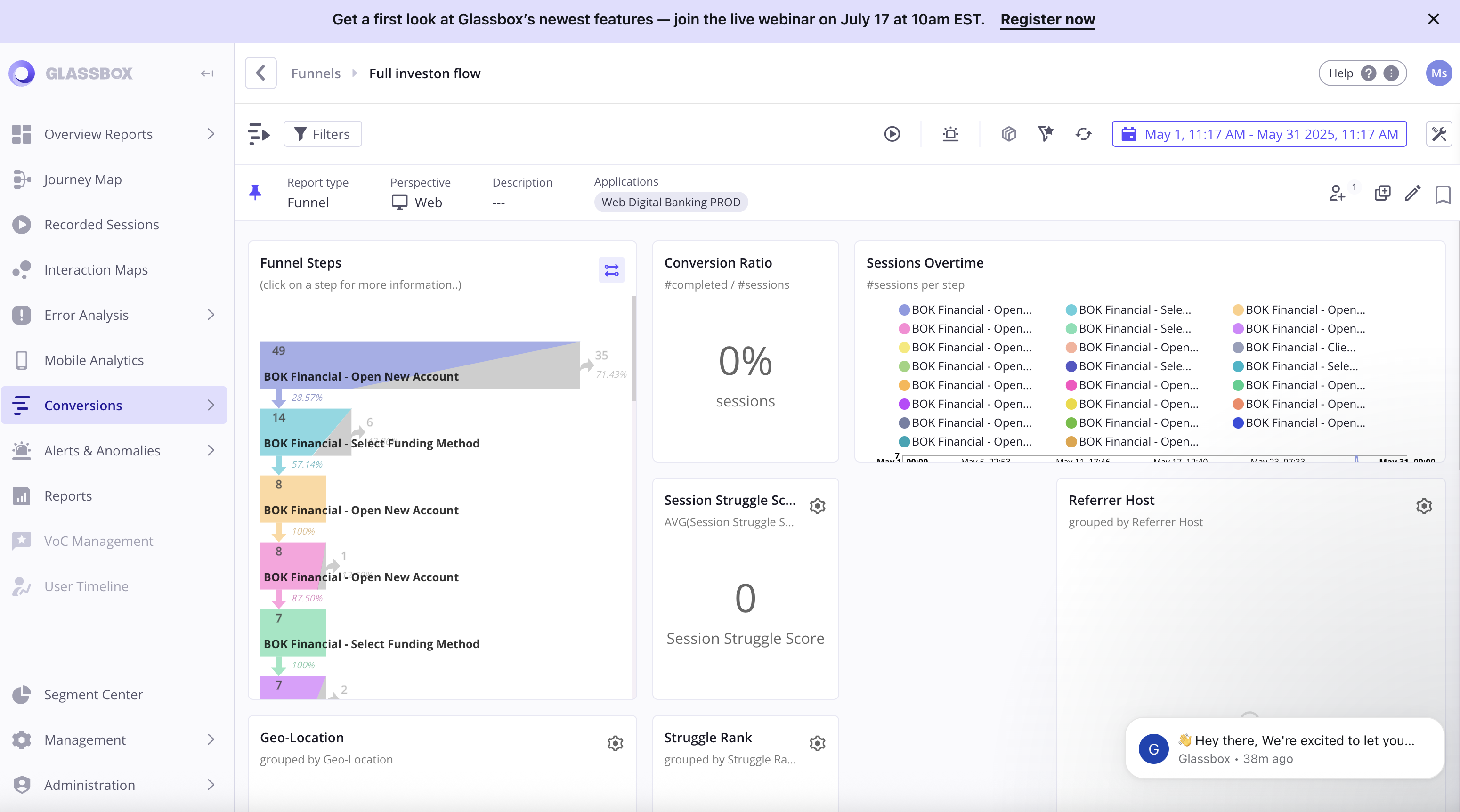
Mapping the Flow: Data That Told the Real Story
When I mapped the full user journey, the data spoke for itself — 4 screens overloaded with cognitive friction and 9 redundant pages clearly signaled the need for simplification, not replication.

The biggest challenge was getting leadership on board, since tackling these issues meant expanding the project scope.
To make the case, I combined hard numbers with a visual story: drop-off rates, average completion times, session replay clips, and a full user flow map highlighting redundant and high-friction screens.
Seeing exactly where users got stuck made the pain points impossible to ignore. This transparency helped secure buy-in to pivot direction, letting us take a user-first approach instead of just copying the old process.
From there, we moved on to shaping the MVP for the redesigned experience.
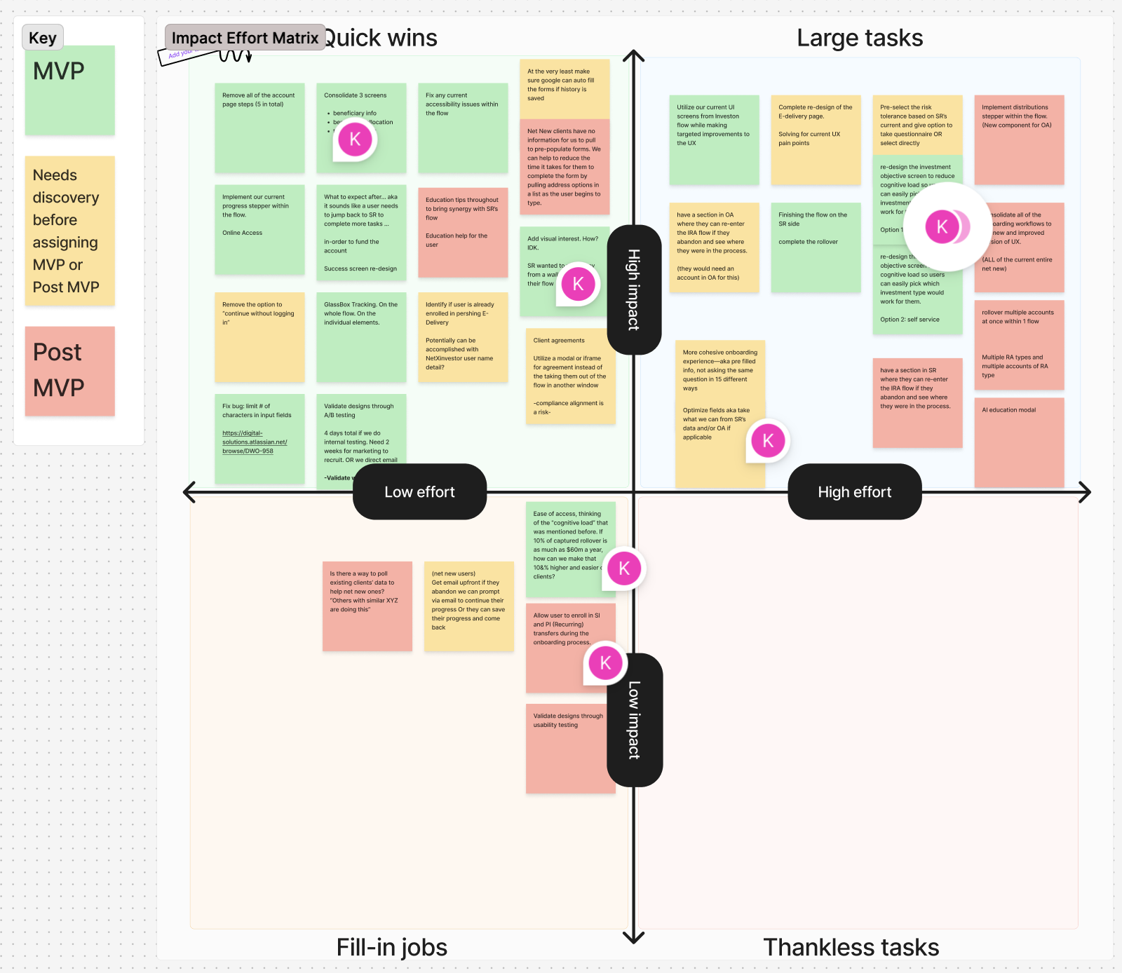
Mapping our MVP: Team collaboration and alignment.
With our buy-in for a re-design, I led our first-ever MVP workshop with developers, product managers, and leadership.
Everyone contributed ideas for the redesigned account opening flow, which we mapped on an impact/effort matrix.
As a team, we voted on what would make the MVP versus post-MVP, creating a shared “north star” that aligned design, business goals, and scope—ensuring every decision had buy-in.
Key takeaways:
Team alignment
User centered priorities
Strategic focus
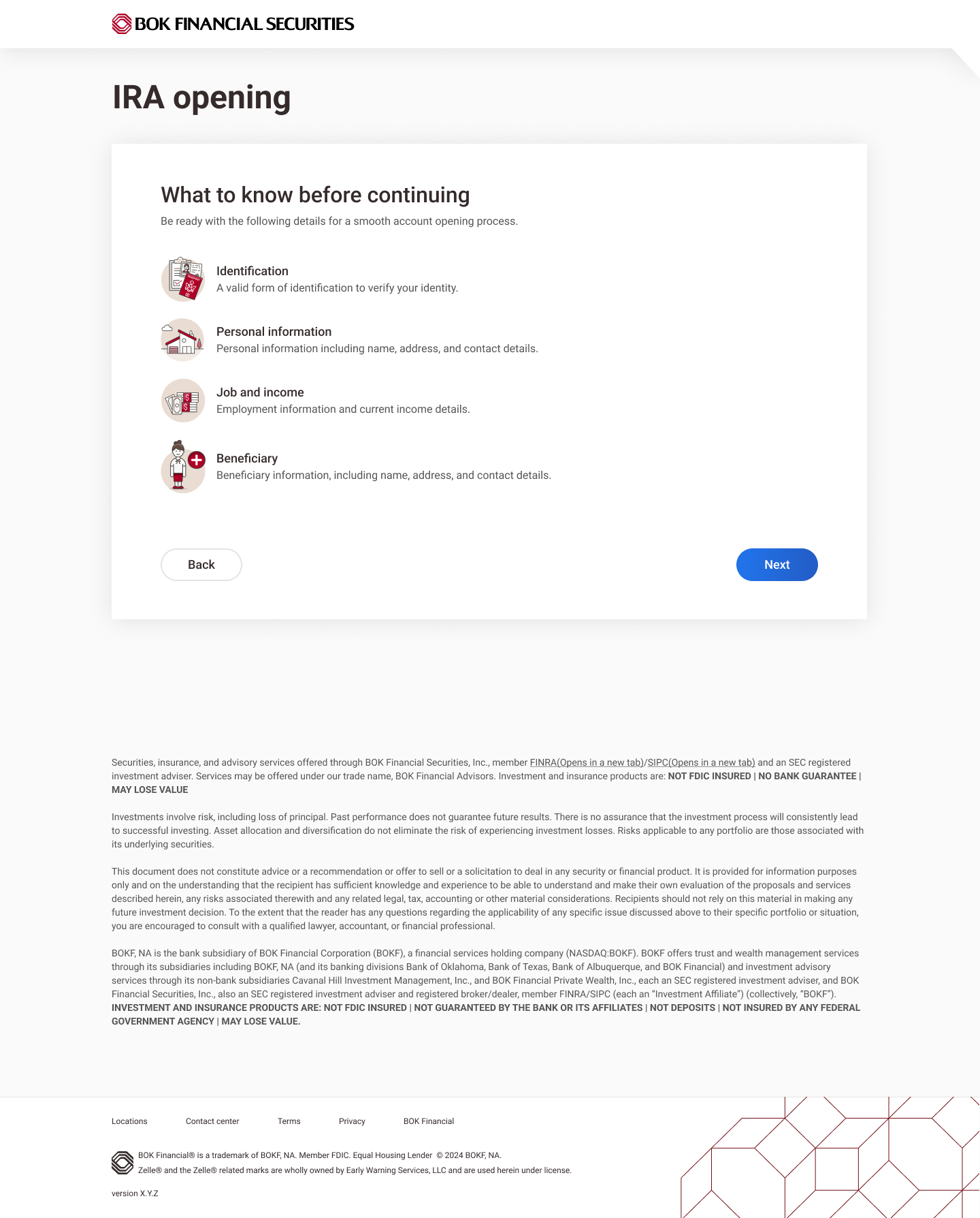
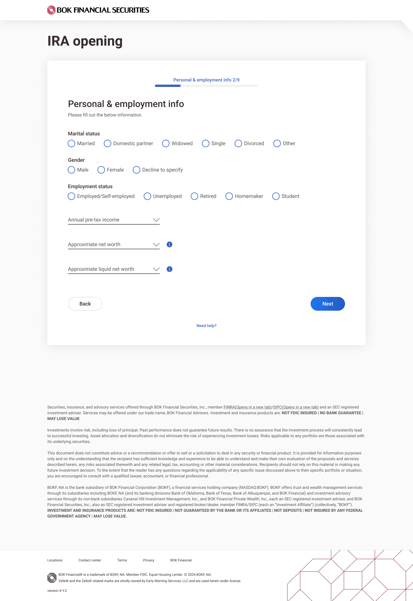
To ensure our redesigned account opening flow truly met user needs, I recommended running moderated usability tests. With these screens potentially becoming the standard for both new and existing account types, it was critical to validate our design decisions early and make sure we were solving real user problems effectively.
Prototype built
Insights & findings
6 usability sessions
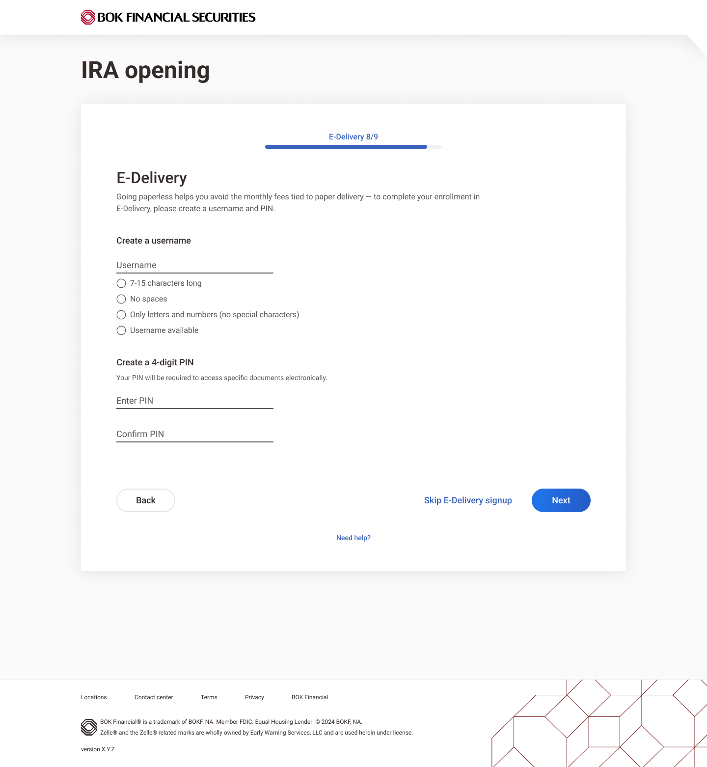
Users felt overwhelmed by too many investment options, dense text, and warning-like red and orange colors, leading to hesitation and uncertainty. I iterated and simplified the text, removed the colors, and organized options into clear categories. Upon re-testing, feedback was very positive: users found the layout easier to scan and no longer felt overwhelmed.


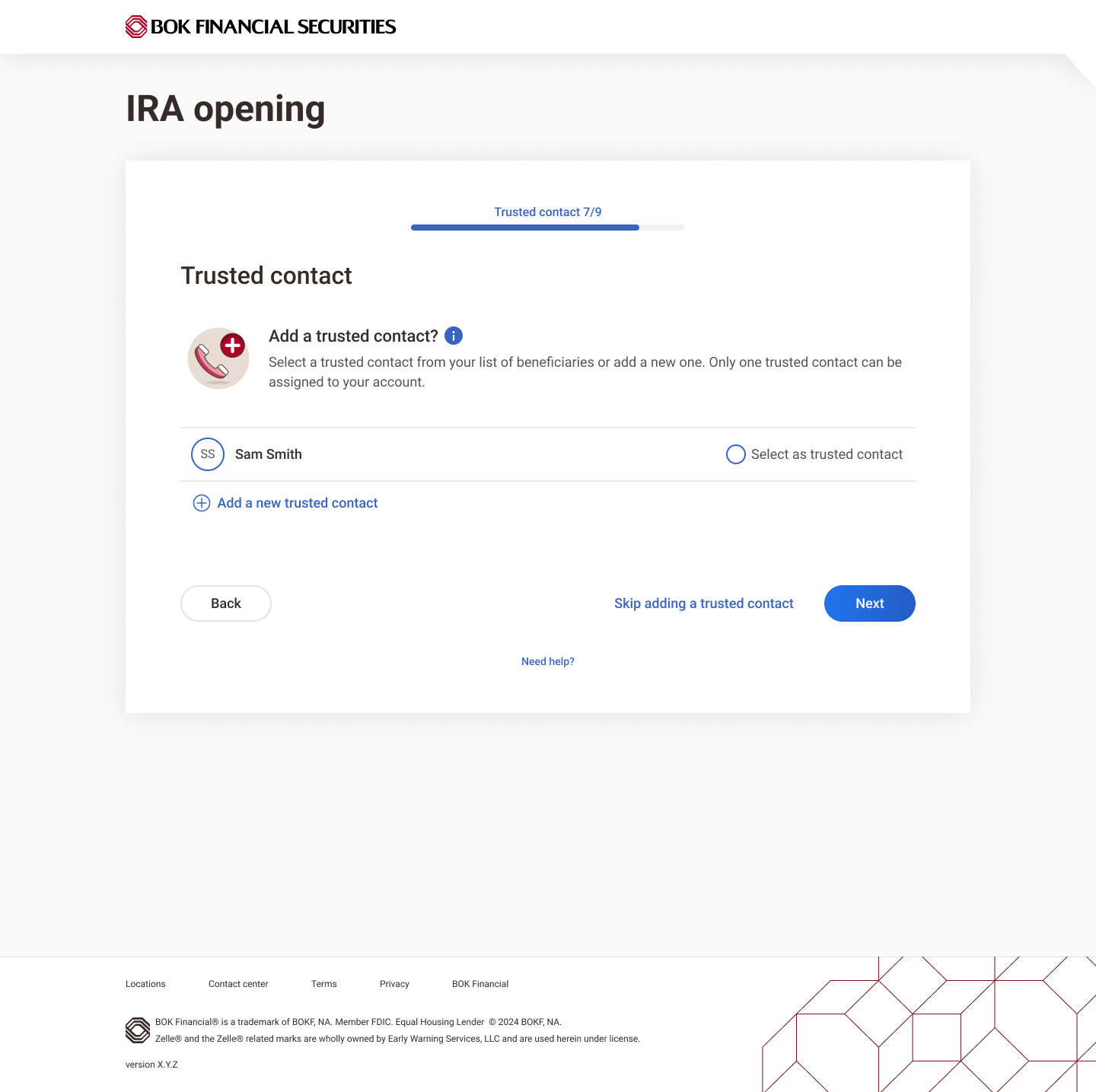
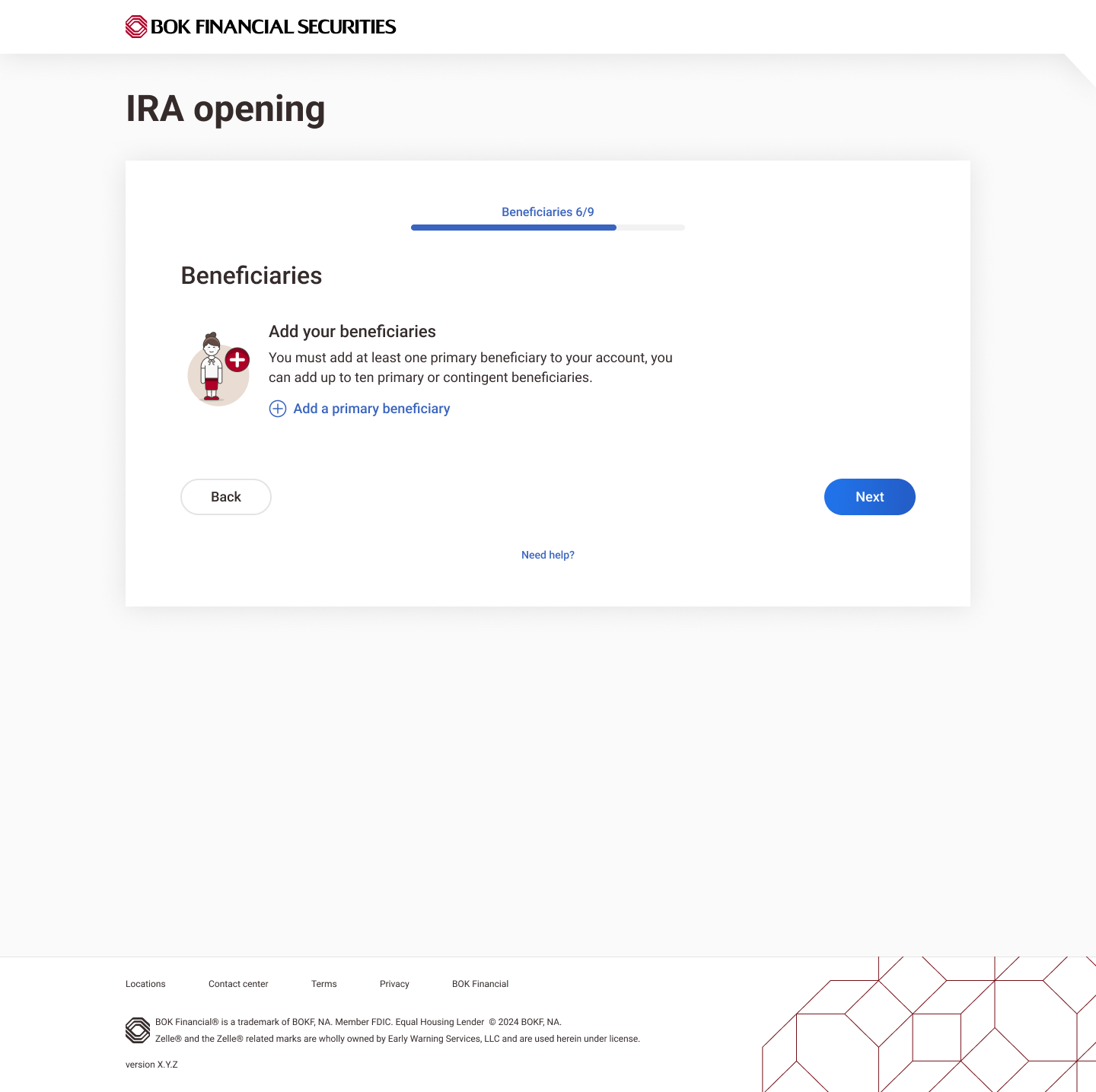
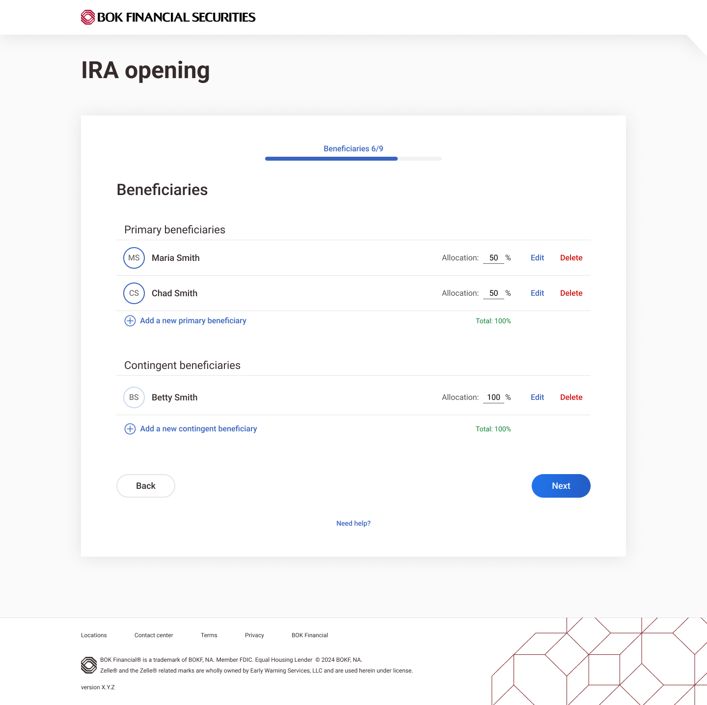
After adding a beneficiary, the next step was to add a trusted contact. Users often skipped the newly added beneficiary and went straight to “Add a Trusted Contact,” risking duplicate entries. To fix this, I moved the link lower in the hierarchy and added clarifying text to the switch. Upon retesting, users correctly navigated to the listed beneficiary instead of re-adding them.


48% faster completion time
45% reduction in user flow
Increased confidence & clarity
Validated by usability testing

Designed and built by: Meghan Sousa