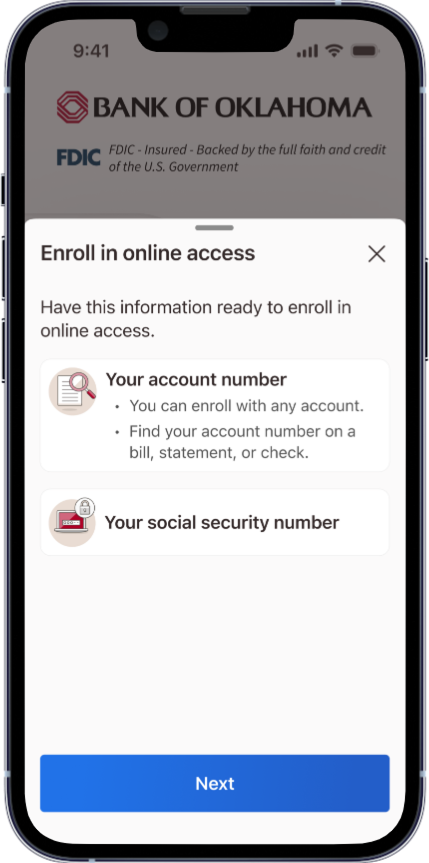
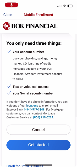
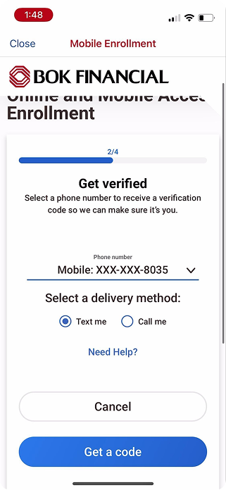
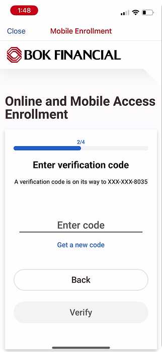
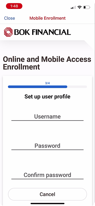
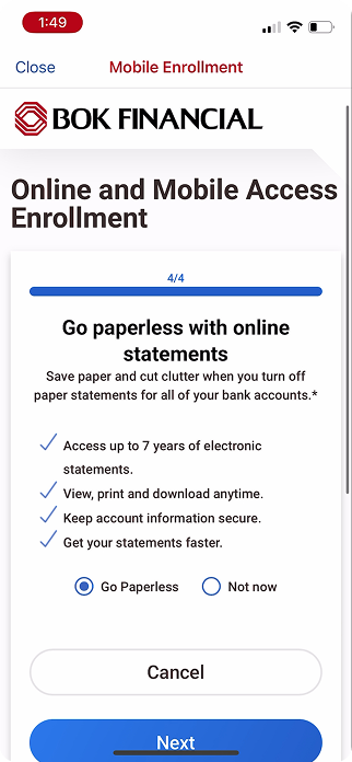
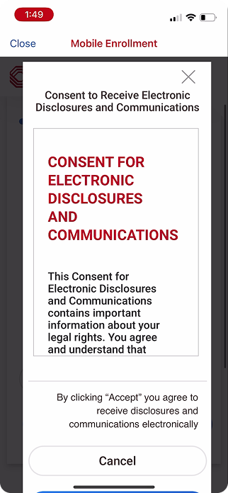
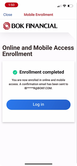
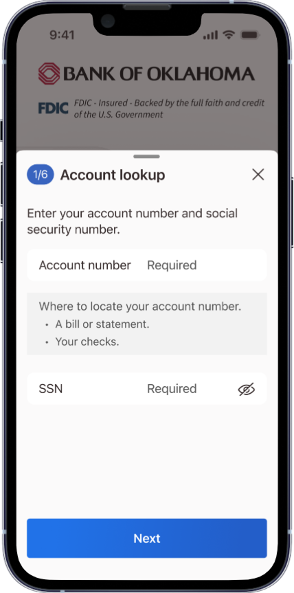
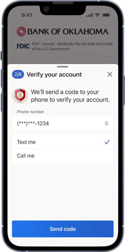
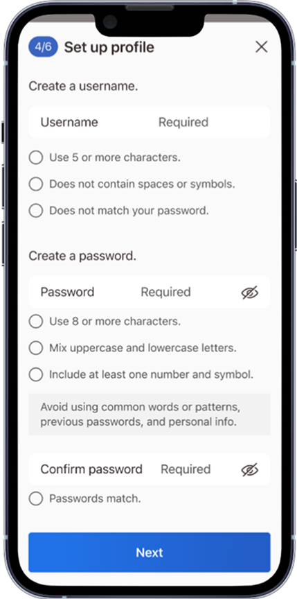
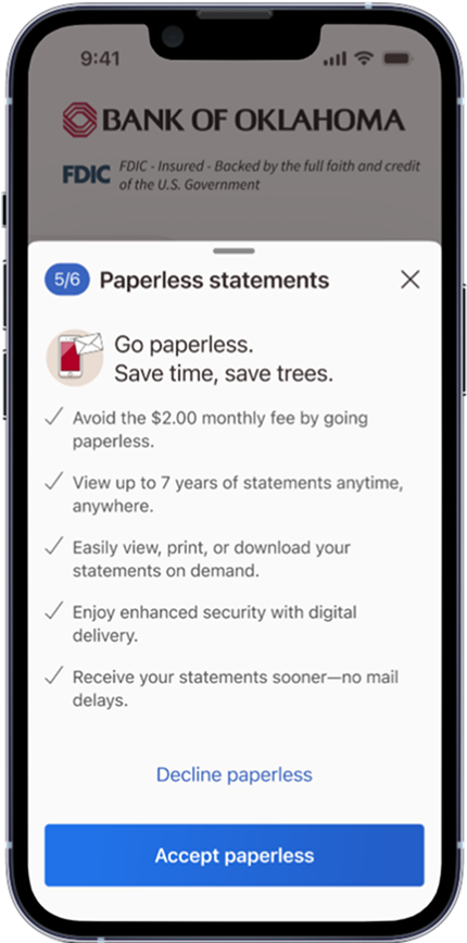
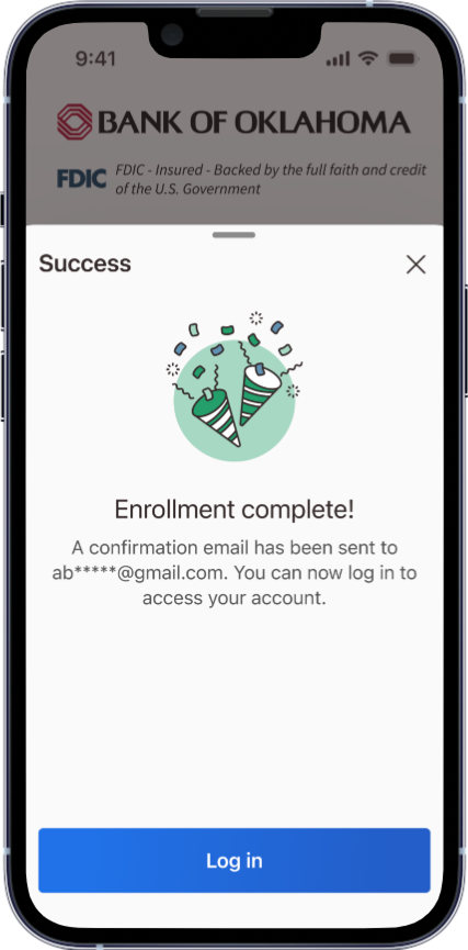
Redesign and optimize the online enrollment flow to modernize the experience and increase completion rates.
Our online enrollment flow was outdated and frustrating for users. Built as an in-app web view, it wasn’t optimized for mobile, felt clunky, and often left users confused. Many users abandoned the process because they didn’t know where to find their account number, leading to support calls or branch visits. We needed a modern, seamless experience that reduced friction and aligned with the rest of our app.
Challenges:
In-app web view caused friction and confusion.
Users struggled to find account info, increasing drop-offs.
Flow was out of sync with modern design and accessibility standards.
Current state screens:
As the lead designer, I reimagined the enrollment flow from start to finish, leaning on our design language to align with the app’s broader modernization. I collaborated closely with product and development teams to deliver a solution that was both user-friendly and easy to implement using native components.
Goals:
Native-first design
Guided user experience
Reduced friction
Modernized interface
Clear account creation guidance
Native components for accessibility
Successful self-service
Seamless Modern Experience
Designed and built by: Meghan Sousa